Google Docs Gets a Menu
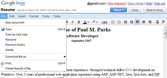
After updating the toolbar, Google Docs replaced the tabbed interface with a traditional menu. The File menu looks cleaner and integrates the revision history, the Edit includes some of the options that are missing from the toolbar (cut/copy/paste) and also the HTML code editor. It’s amazing to see that Find & Replace is still in alpha and doesn’t work as advertised. The Insert menu has the same features as the homonymous tab, Format replaces the Styles dropdown, while Tools lets you select the document’s language, check the spelling and read stats about the document. The Table menu was previously available as a contextual menu for tables and there’s a new Share drop-down that integrates the options to share a page, publish it on the web and preview it.

Google Docs includes all the menus from Microsoft Word 2003, except for View, Window and Help, but there’s enough room to add more menus in the future. The team’s blog explains the changes by invoking a user study, but the truth is that most people are used to Microsoft Office’s classic interface:
A while ago, our Docs User Research team worked on a “card-sort” study in which we disconnected all features in the application from the places we had put them in the UI, and asked some people what the labels and icons meant to them, and how they would group the concepts they represented. One of the things we found was that names such as File, Edit, Format, and Tools resonated as “where you might look” for certain editing features. Check spelling? Seems to fit in a “Tools” group to many people. Find and replace? People generally look for that in an “Edit” group.
These updates are only for the word processing application, as Google Spreadsheets and Presently continue to use the old interface. Having an unified interface and a set of features that work consistently in all the three applications should be a priority for Google.Via http://googlesystem.blogspot.com/
